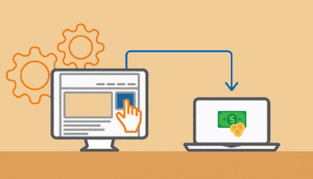
Lead generation is the first step of successful digital marketing efforts. But, generating high-quality leads that can really convert is still the biggest challenge which digital marketers are facing these days.
As per Marketo – 96% of visitors who come to your website aren’t ready to buy (yet).
So, what should be done for high conversions?
Your landing page should be solid enough to persuade your visitors to buy from you.
What should be done to design a highly convincing landing page? Just follow the below-mentioned practices –
Great Headline
Writing amazing headline on a landing page would do your 80% of the job of convincing your visitor. The visitors are likely to close down your landing page if they find an uninteresting or ambiguous headline. Keep the headline simple, precisely conveying how beneficial your offer would be to your visitors.
Positive Reviews
Adding positive reviews to the landing page can help you gain the trust of your visitors. People usually look for reviews before buying any product or service.
Ensure that the reviews you post on the landing page are natural and don’t seem to be too good to be true. Fake reviews can be more dangerous than no reviews at all.
Persuading Copywriting
The content of your landing page should be persuading enough to encourage your visitors to take action. This is possible only if your content is interesting and is able to engage your audience. A/B testing can be done for your landing page content to find the content which drives maximum conversions.
Attractive Color CTA
Call to action is the most important element of your landing page and if it is in a dull or boring color, you would never be able to convert. Give an attractive color to your CTA and experience the boost in conversions.
Using Human Faces
It is a common tendency of people to notice the human faces before they even read the other content or view the images and videos. It is right to use human faces on your landing page, but only if those faces are recognized as that would help you in winning the trust of your visitors.
However, using human faces near the CTA can be a risk as that may distract the visitors from noticing the CTA. So, just be careful while you are using human faces on your landing page.
Readability Check
The format of your landing page should pass the readability test in terms of –
- Use bullet points
- Ensure enough white space
- Utilize headings and sub-headings
- Include visual elements in between of text
If you include only text and that too long paragraphs, your audience would lose connection and might move on to other websites. Thus, readability check is mandatory.
No Extra Links Required
If you want your landing page visitors to focus on CTA, you just need to remove the extra links on the page. Your visitors can easily get distracted and click on other links of your page and their decision of buying remains pending or gets out of their mind. Just help your visitors to take purchase decision without any distractions.
Consistent with Advertisement
Your visitors are coming to your landing page through the advertisements you have posted on different platforms. After coming to the landing page, they should be getting exactly the same which has been promised in the ad. For that, you need to maintain the consistency between the ad and the landing page in terms of color, text and brand image.
Sense of Urgency
By adding simple phrases like “Hurry, offer till stocks last” or “Limited Quantity Available” can create a sense of urgency in the minds of your visitors and encourage them to take quick purchase decision.
Important Stuff on the Top
The writing style of your landing page can make a lot of difference. Always prefer to keep the important stuff which can really add value to the readers on the top. The landing page content should be to-the-point otherwise, your visitors may lose interest and move on to other websites.
Conclusion: Testing Landing Page Practices
All the above-mentioned landing page practices have been proven to be successful in increasing conversions. Still, it is always better to test these landing page practices as it is not necessary that the tricks which worked for others would work for your business too.
There are surely many more landing page practices but it is all about trying new tricks everytime to achieve success in maximizing conversions and ultimately growing business.


 Menu
Menu


