Website conversions are the heart of every business & to improve website conversions in a frequent interval is necessary in order to keep in par with the competitive business market look-ups & the growing customer needs. Let’s take a look on a few tips/secrets to soar your website conversion rates!
- Website types are of 2: Branding ones purely to create brand loyalty and awareness which takes a lot of time and money and Direct response types which are built such that they intend to grab the people response right away. Direct response websites are built using the maximum possible number of words needed to ‘sell’ a site, targeting a specific crowd towards a specific action with the end goal of leading to sales. Calling, filling forms, signing up for mails, using a coupon or anything of this sort can be the action made possible. Make sure to have direct response sites.
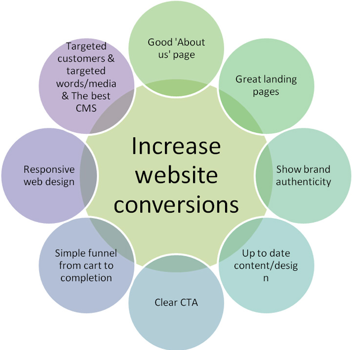
- Ensure to have a responsive web design. This includes redesigning website post evaluation of the right font size, font colour, background colour, right colour contrast, compatibility on various browsers and in various mobile devices, load times for various internet connections of which making a mobile friendly website/user friendly website/ all device compatible website is the most important keeping in mind the smart device soar today!
- Capturing leads at very good rates is possible by sending people to well targeted landing pages? Yes. Offers not gated through the landing pages don’t support the leads; landing pages are the collection tools! Every form signed up on the landing page is a conversion number gained. Tracking reconversions of available leads is via landing pages only. Social media shares, PPC ad links, organic search connect and much more are achieved by the landing pages. Make sure to make them the best!
- Call to Action buttons in the same colour as the site headline/logo with all the elements off the page as with Dropbox, slide-in-call-to-action that asks you to stop all else but click on this button, having the right font and wording on the CTA button, suitable surrounding design/images, having not many elements bright or gaining attention in addition to the CTA buttons are all some basics to have the best CTA. Do you note?
- Ensuring your online presence is for an authentic brand, having open transparent communication, answering for mistakes & rebuilding connect with genuineness like how Dominoes did are all important in going towards high leads. Dominoes’ financial generation on brand authenticity showcase has been enormous!
- Make sure your sales and marketing team is in line with your business goals. The content you try to present/sell should be honestly actionable and applicable. Don’t try revenue even before relationships!
- Having a simple yet effective ‘About us’ page and doing a website facelift/ redesign to keep up to the ecommerce trends are important in view to increase website conversions. About us page should really reflect not just who you are but more importantly what you can do for the people. When you see a lesser sale or high bouncing rates or non appearance in top 2 SERPs, or any of these sorts then get alarmed you need to do a redesign of the site!

Now that you know some of these basic checkpoints towards seeing a higher website conversion rate, are you sure to have the apt expertise to achieve the goal (for web redesign or CMS build or any) at an ideal time and effort? If you think you need a support, ask us right now at QeHTML for you can be sure you would get the best!


 Menu
Menu


