Author Archives: admin

Things to know about PSD to HTML5

Things to know about PSD to HTML5

Responsive web design, mobile friendly website, user friendly website, all device compatible websites have become the need of the hour for an ecommerce website development to combat the needs of the customers who have grown in numbers in using the smart phones or hand held devices. CSS3 comes alongside of HTML5 so you make a responsive website using media queries.

For beginners who are just getting to work on web design using HTML5 and CSS3, a few step guidelines on PSD to HTML5 conversion will add a lot of value we believe. Read on for the steps,

  • PSD design: To start with, it’s important you have a good PSD file. Make sure you have a sufficient understanding of the venture only when you can come out with the best PSD using the necessary header, footer, navigation, sidebar and all placed appropriately. Also make sure the design is made in layers of Photoshop so that you use the right things at the right place with the help of the slice tool
  • Colors: Colors though come under a part of the PSD design; they require a special attention because they form one of the prime elements behind the success of a website. Color preferences differ even between the 2 two genders. Make sure to select the right colors for your website grasping the theory of colors.
  • HTML5: W3C recommended HTML5 has eased the web design process; images are no more a necessity for a good looking website, CSS3 & HTML5 do a better job for the CTA (Call To Action) rather than an image doing it. An increased load speed is possible due to avoiding high resolution images & flash based videos but don’t miss if you definitely need to use certain images. Make sure you know fully about HTML5 to get the best out of it.
  • CSS3: Website redesigning with lesser codes has been made beautifully possible with the CSS3 raised out of HTML5. Selectors and properties available, 2D/3D transformation choices, gradient, 360 degree transition, border image for border creation, text shadow, and so have made the designing so good for an estore today.
  • Media queries: Media queries to convert a site into a responsive one comes with CSS3. The media dependent style sheets are created to accommodate different media types, as in width, color, height which helps the website easily adjust to the size of the screen of the device in which the site is used.
  • Knowing the PSD to HTML5 doesn’t end here but definitely requires the expertise and experience to use all of these in an appropriate manner in the right context for the right site. If you require any assistance in using them or require a complete web design converting PSD to HTML5 or making responsive websites or any ecommerce service, feel free to give us a shout!

Statistics on mobile usage and adoption

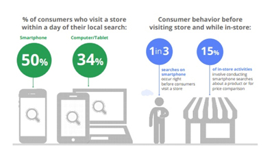
To mention on certain figures about the mobile usage these years, the first and the foremost stunner is that Mobile is strongly believed to go ahead of the fixed Internet access by 2014″ predicted by Mary Meeker, an analyst of technological trends annually.

The mobile statistics curated at Smart Insights in the talk here include the below,

  • Smartphone owners against Desktop owners
  • Usage of Mobile against usage of desktop
  • Ad usability in mobiles
  • Conversions in Smartphone against that in Tablet

Mobile marketing is very important without which one can be sure to stay unnoticed in the business for any number of years together remaining the same. Let’s try to understand what customers react to using different types of mobile devices and desktops. While the mobile trend was as low as 400 million users globally in 2007 with the desktop users being close to 1100 million users, in 2014 the curve has grown enough that both coincide to be a single figure which is 1700 million around. In 2015, with not much surprise, mobile users have surged past the desktop ones.

To mention on the key trends,

  • Mobile media has now overridden desktop and rest. As an example, taking the data in US, mobile media time is higher at 51% compared to the desktop which is at 42%. Dissatisfactory mobile experience or the complete absence of your website in the mobile search is sure to push you out of the market.
  • Time spent on different types of screens taken through the data from 2010 till 2015 shows the steady increase of mobile screen usage compared to the desktop, tv and other devices. While the tv, desktop and other device usage has been consistent all through these years, mobile has grown from being used for just 0.4 hours a day to 2.8 hours a day in USA.
  • Advertisers are yet to respond completely to the mobile media trends. Checking the 2014 statistics of how businesses spend time in Media or in the advertising spending, while 24% of the expenditure is made in mobile only 8% of it is put on advertisements.  In 2015 mobile ad spending is better accounting for 49% of digital ad spending almost the device usage! These stats also convey what’s projected for future, which is important as it shows where how the market is. The future of digital is mobile, and within 3 years it would dominate digital ad spending.
  • More than 3-4th of the internet users owns a smart phone; In addendum, emerging yet other smart devices are smart tvs, smart watches and smart wristbands today. Google’s research says search was the key starting point for increased mobile usage. It accounts to 48% while branded website usage and app usage account to a lesser figure.
  • Among mobile app and mobile site, more than 3-4th of the users prefers mobile apps.
  • Add to cart rates and sales conversion rates are much lower for smartphones compared to desktop which raises the question how much businesses are taking mobile responsive sites seriously!

A few more statistics added to these definitely removes the anxiousness why one should make mobile friendly website, how it adds benefit to business growth to increase business revenue, why responsive web design important, how mobile usage has increased and how Mobile advertising responses should open the eyes of businesses. If you are in search for the best web development services, no wonder why you should contact us!

Is your site lagging behind in latest website designs?

Is your site lagging behind in latest website designs?

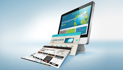
When it comes to designs and websites on the internet, you must have noticed – the ones with the most chic and elegant looks stand out and are the ones that are ranking on the top. Every single search engine expert says that the design has to be good. So, what is this? What is the best design that everyone keeps saying about?

Good Design is not about crystal clear pictures or flashy banners running on the website only. Neither is it about meta data based HTML pages and the right keyword content. It is about the combination of all of this and much more. Its primarily about how effective your design is and if it reflects the business that you represent.

What represents a good design? Is your site based on the following:

A design architecture that supports your business concept.
Images and a background theme/design that justify the content
A design that looks ‘too busy’ and cluttered and needs lot of understanding from a user’s perspective.
Is it easy on the eye
Is your design in trend with the latest practices in market
Is it compatible with HTML 5
An elegant Landing Page

These are some of the factors when you talk about a website design. And if u have designed around these pointers, then you’ve got most of it correct. Missing on these basic points would mean that the visitors will skip quickly to other websites.

It is important to keep the the visitors engaged. If you can grasp their attention and make them stay for more than 20 seconds then there is a good chance that you can convert them to potential business. An average human mind spends less than 10 seconds on a page and tends to go away. So, you need to know if you have a ’20 second’ website – one which convinces a visitor to stay a few seconds longer and explore further.

Get your website reviewed today itself and know what’s wrong and where and what can be fixed. Don’t lag behind in the race for the best design in the market place.

Do it the Logo way

Do it the Logo way

Brands are great show stealer. A brand is adverdently represented by a Logo in most cases. Logo’s quickly grasp attention and convey a message in the shortest way possible. If you own a business and wish to represents yourself as a brand, Logos help you to do so. You will also be amazed to learn about the amount of business a logo can bring. A logo representing your brands entity can add zing to your market presence and also helps the business to expand in other directions. Logos capture the essence of a business entity in a small visual package. Logos help you to penetrate the market without having to put rigorous efforts when compared to other marketing strategies.

Here is what Logos do for your business:

Represent your brand of business in a symbolic manner
they are the face of your business. Even alphabetic logos do a lot of easy branding
Gives confidence to new and potential customers
Give a sense of faith and assurance
Easy to venture into different markets based on logos based brand recognition

Often businesses who have succeeded in one market place tend to venture into an altogether different market. In such cases, the competition is high because there are existing business entities. An existing brand name helps people to relate to and hence exposure to an existing customer base.

Logos make a very strong impact as compared to any other marketing strategy and the impact being visual in nature can be long lasting. It is important to note here that relying totally on the logo design for business acquisition can be dangerous. But yes, website’s color, product/services signature colors, the theme styles if based on the same premise as the Logo or vice-versa can help in boosting the business. They provide a platform for recognition and a long term business based on brand loyalty.

Be a brand and see the difference it makes to your business!

Add Color to your business

Add Color to your business

Not able to choose the correct color for representing you through your website? You are not the only one facing the dilemma. Like any other online businesses the though process is to make a informed decision about the right choice of the color. What is important to understand here is that the website color might not hold importance as a stand-alone factor but the combinations with the rest of the items to build a theme makes it a very important factor as to how the overall website would look to the world.

Some of the common questions that need to be responded to while struggling with picking the right color combination are:

Is the website too gaudy or too dull?
Is the color so strong that its hard to look at?
Is it contradicting my business perspective?
Is it totally out of standard representation when compared to similar businesses?
Is the color diminishing the impact of my products/services totally?
Does the color combination reflecting the website as unprofessional?

Though considered to be the last factor and priority, these questions do crop up when you design a template or prepare the logo of the website. Incidents of websites going real vague from clean designs are common – the reason being the not having the right combination of gradients or pigmental colors.

Neatness is is important. Right combinations deliver neatness with clarity and crispness. Your website immediately draws attention if its clean and crisp, designed with the right color combinations. A visitor might not be keen to buy your product or service immediately, however, he or she might do so later if they have felt the impact of the website the first time. It should be a visual treat! And that helps to build a loyal customer base.

Color can add life or it can kill! It completely depends on the choice you make!

Happy Websites are Responsive!

Happy Websites are Responsive!

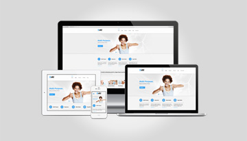
hat is right! If you are happy, you would respond to everybody! If you are not, you would simply go into a shell and shun the world. Websites are pretty much the same. A well crafted website that is uniform and compatible with various devices works wonders in increasing visitor traffic.

More than half the population across the globe is now using smartphones. The basic expectation is that any website that is accessible on a desktop or a laptop should open and be legible on their handheld devices as well. Easy accessibility is the game winner!

Here are a few of the salient features to keep in mind:

Is the website compatible with all kind of screen sizes and resolutions
If website the is legible on a phone, then it should also be legible on a tablet as well.
Is the menu properly accessible; menu and other links should open in an organized manner
Banners and pictures don’t break or haze out
The header and footer section should fit the screen size and resolution.

These are some of the important factors that often get ignored. It is not just about managing to push your website into the device screen size and resolutions. The website should be fluid and easy to access and the CSS shouldn’t get stuck while accessing the internal pages of the website.

Responsive designs and templates are in trend right now. Nowadays rarely would you come across a website that is not responsive. Responsive means being accessible and legible while maintaining the structure no matter what the screen size or resolution. If you don’t have a responsive website, your business will suffer as it won’t be cater to all the visitors. Web designs laden with heavy graphics and animation can be resource consuming and can fail to open on the phone screens and so having a responsive design saves the day!

Bewildered – What to choose – Magento or WordPress for eCommerce?

Bewildered – What to choose – Magento or WordPress for eCommerce?

With the market flushed with a generous number of e-com platforms to choose from, the decision making becomes all the more harder. And, it only gets worse with each platform offering numerous functionalities that are designed to support and cater to particular e-stores. This can leave you perplexed and in a dilemma, as to which framework to put your finger on.

Like any other business your purpose is to grow over a period of time. Now, what the growth rate is And the consumer base that you are looking to cater to makes a huge difference in your decision making. You might want to have an ecommerce site that is simple in its functionality and then on the other hand you might want to have a platform that supports your growing online business.

Both WordPress and Magento are Content Management Systems offering similar functionality(most of them) to build and setup a highly functional ecommerce store. And since the functionalities/ features are so similar nature it can confuse the retailers as to which platform to choose from.

The easiest way to make a decision is to keep in mind the objective of setting up an online store in the first place.

So, let me break it down for you when I say ‘Objective’.

Now, if you have limited products/ services to offer and you also want to manage content and updates about your organization, then WordPress is better suited for your needs. This is because WordPress is content driven. WordPress is also one of the best blogging platform, so automatically your need to keep your customers abreast with your services and latest news is taken care of.

Also, since WordPress is more content driven, you need to use plugins for incorporating additional features. This can give you additional room for exploring. However, this can also be a cause of concern on account of being less reliable.
Earlier using 3rd party plugins was a risk but with the latest release of WordPress version, most(if not all) of the vulnerabilities have been fixed. However, its always advisable to use any 3rd party plugins with caution(recommendation: use verified 3rd party plugins).

Magento on the other hand handles large product catalogues of ecommerce stores like a charm. If your objective of setting up an online ecommerce store is to just sell products, then using Magento will best fit your needs. Magento helps in forming and setting up a business structure to enable you to sell online.

Now unlike WordPress, Magento has been designed on a platform that is meant to provide solutions specifically for large ecommerce stores. And since it doesn’t need 3rd party plugins to add any functionality, its more secure. Like most typically large online ecommerce stores Magento has built-in options for shopping cart, payment gateway, shipping methods and much more.

Now, Magento as a platform is more extensive than WordPress. What this means is that WordPress is relatively easier to use of the two. But if start using multiple plugins,then getting around WordPress can become a burden. You would need a certain level of expertise to be able to use Magento.

Each platforms have their pros and cons considering How you want to use them. If its content driven with partial selling, then WordPress is your best option. If selling a large no of products is the sole purpose of you setting up an online store, then Magento is the platform for you.

In conclusion, it is the Objective of setting up an ecommerce store that can help you in making a uniformed decision when choosing WordPress or Magento for developing the site.