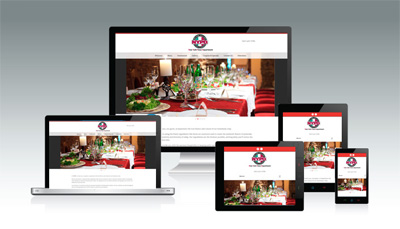
Yummy foods need to look yummy in the web otherwise they will never be known yummy. It isn’t just a rhyme but it is highly important restaurant website and food websites project the foods in an excellent looks in the web be it in desktop url or in the mobile site. What all to care upon in a hotel web design? Ride along,
This isn’t any hyperbole. To sell even a shampoo or a tooth paste, a retailer puts in efforts to make the product look bright and just too nice to grab the customer attention and then comes the subsequent pay based on the real quality. Just imagine how amusing the food has to look then to get the mouth water out of the people?! Poor photography does more loss than the poor food for the first time prospects as they would never be turned to customers. Exhilarating photos could earn more bucks or not is a question ‘two’ but bad photos are never going to, in first place
Visuals for a restaurant website should consider not just the foods but the building ambience and the physics of the place as well. Having great foods in a great place is what we look for. Isn’t it? Not just an excellent food in a stinking atmosphere.
How the people, who serve, look really matters in customers getting drawn to the place. No one likes to get served from someone who doesn’t look presentable, quite obviously! Having a great dress code, neat and professional for the hotel staff is very important
Texture is a wonderful magic quite available in your own disposal as a restaurant owner. The home page with various awesome textures in back ground and as well in the actual photos is the niche of top designers. Colours set the moods of people and enhance the hunger or even create it completely! Bright colours are a great choice; don’t be hesitant to play with them ‘sensibly’!
Showing fresh fruits or fresh veggies or sauces in their half cooked form or desserts while in the process of completion entices the people because they know you use real stuffs to get the quality foods.
Food menu used for desktops shouldn’t be used for mobile sites for the simple reason no one likes to pinch, zoom and read but loves to see the texts just handy to read as such.
- What is served in the appropriate menu and graphics
- What is served in the appropriate menu and graphics
- Cost for the items
- Graphical representation of the place to show the ambience
- Whereabouts of the place
- Ability to make reservations online
- Contact number
Knowing the basics of web designs, tactics for Responsive Websites, about why responsive web design important, how mobile friendly website contribute to benefit business growth and increase business revenue, what are the nuances in designing restaurant website for a greater business growth and more, we ensure to give you the best for your restaurant website in mobile or web. Just ask us here.


 Menu
Menu


