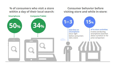
An email newsletter is crucial to build customer relationships and keep the companies top of mind with their audiences. A well designed and executed newsletter is a powerful tool that brings business. That is why it is important to create an attractive newsletter that can appeal more and more consumers. If your newsletter looks good it is obvious that more readers would be invoked to read.
Here is a list of some of the best design tips that would make your newsletter fascinating.
5 Design Tips to Make Visually Appealing Newsletters
1. Create a killer header
Without any doubts, your newsletter needs an appealing header. It is just like a magazine, newspaper or website name. It appears on the top of your newsletter and should include the newsletter title, your company name, and your logo.
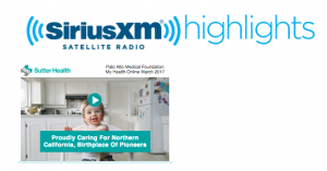
Tools such as Stencil and Pixlr can help you greatly in making cool headers. These tools provide DIY state of the art graphic design experience to create and save graphics to your computer. You just need to create your header once and can use it again and again.
Here are a couple of examples:
2. Use color schemes according to your logo
Your newsletters need to look vibrant and colorful. Because your logo is a part of your header, consider using its color throughout your email newsletter as font colors, borders or other elements. Try keeping the same color in the entire newsletter.
3. Don’t use fancy fonts
The simple, the better! While selecting fonts for your newsletters, keep in mind to employ those which are readily readable and widely used. You can try fonts such as Times New Roman, Calibri, Helvetica or Arial. Refrain using too many fonts in one single newsletter. This can easily distract the reader. Pick one or two and stick to them for each newsletter you create.
4. Pictures
A visually appealing newsletter should have both text and images. An image instantly captures the eye of a reader. By putting few pictures, you can visually attract your reader and can also enhance the effectiveness of your message at the same time. Here’s an example from San Francisco Bay Area-based The Spanish Table:
For example,

A cupcake eCommerce store
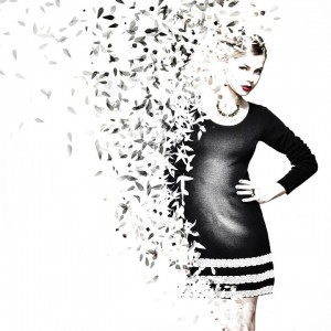
An apparel eCommerce store’s picture
5. Use Subheadings
Your newsletter should have several contents broken up by the subheadings. The font size of the subheadings should be smaller than the header but larger than the text used for the articles. Here is an example of the apparel brand’s newsletter. It also tells readers about the new arrivals, offers, and schemes.
To conclude…
When you’re creating the next newsletter, keep in mind that you want to attract the maximum number of readers over the internet. Make sure your readers are engaged reading your newsletter. A well designed and crafted newsletter acts as a spur in bringing the right customer engagement. Use these six tips to spice up your design, increase readability and create an email newsletter that your audience looks forward to receiving.


 Menu
Menu