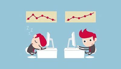
The website is a revelation of one’s business, brand, motive and customer reach. A visitor turning into a customer for the products and services you sell totally gets decided at the first time the site is visited. Homepage is the greetings which is either going to be successful in retaining the visitor or distract him towards other websites. When you come across the situation where you see the users aren’t sticking long to your website once they access the homepage, you’re sure you’re losing the traffic. Know why!
- Clutter: Where the homepage is flooded with too much of information, the user doesn’t intend to check many of them and tends to go away.
- Basic HTML designs: When businesses don’t want to employ someone demanding a good sum and goes ahead with basic html designs, it might sometimes end up in very basic design involving regular text on a basic interface which makes the user suspicious on the ability of the business to deliver complex services.
- Language blunders: There are some basics which we can never miss to ignore whatsoever be the standard of the deliverables we give functionally. If the products and services you do are just too great but then the website has even a few errors in language basics as in grammar or spelling, it doesn’t give a good view of the business. Authenticity of you is shown here, don’t be careless!
- Stock Images beyond limits: Only when in high end urgent situations like an article going live much earlier to the planned time or so, one can go ahead with the available photographs. Otherwise mediocre photographs never work.
- Sound from auto playing flash or videos: Ads throwing their flash video widget content right on the users face or urls playing music at the background isn’t any pleasing to the people these days. They tend to miss the valuable service/product you provide. Regular Java and HTML in a simple interface works the best.
- No contact details: Make it easy for users to reach out to you. Make sure to provide company’s email address and contact numbers. When it‘s just the mail address, it is quite annoying for some users to wait till the response is received even for simple tasks that take a min or two over the phone. Make sure to have an alluring Contact Us page.
- Ads aren’t always exciting: Ads are ought to be given a thought as how important they are for the business revenue. Video ads in every page or a colourful banner in corners of the web pages might be your thought but be aware it distracts the users who find the interface too technical. Make sure to retain the average users before you try out these.
Having said these which aren’t any rules for you to stick onto but which have been identified as some of the major causes for declining number of users on a website, if you are looking out for the best web design service provider in web development to create the responsive web designs for your site or implement CMS like joomla to give a great design using images, CSS or so just ask us.


 Menu
Menu
